
A good game menu starts from the game's story. Mine has three screens, an in-game store, a message screen and a controls screen, built from one frame, three tab buttons and icons the player already knows from the game.
Start from the story
Imagine you're building a game. The player owns a property and invests in it: brick walls, a wooden floor, heating, ventilation, plumbing, arcade machines, windows and furniture. Better property attracts tenants. Then a message pops up: you can now earn with billboards, invest yes or no. Every item in the store is something we built in the course, so the menu tells the same story as the art.
Three screens, one frame
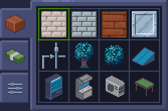
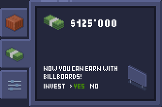
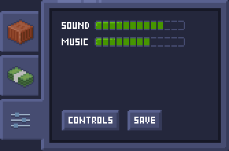
The frame and the three tab buttons on the left stay the same on every screen. Only the content changes. The tabs use the same icons as the content: a crate for the store, cash for messages, sliders for the controls.
Item icons

Small icons follow the same rules as any sprite: one light source, a clear silhouette, a few colors. At this size every pixel counts. The coin is only 11 by 11 pixels, so its highlight and shadow are a handful of pixels each.
Rules that keep pixel UI readable
- Check every screen at real size, not zoomed in. If a label is hard to read at 1x, it's too small.
- Use one outline width and one corner style for every frame and button.
- Keep the palette shared with the game art, so the menu feels part of the world.
- Make the selected state obvious: the store marks the chosen item with a bright frame.
- Build frames so they can stretch: corners, edges and a center that repeats. Then one frame fits any screen size.
Your turn
Take the idea and change it: a new button style and shape, other colors, your own messages and thumbnails, more items, or a different story. A fantasy shop, a spaceship's cargo bay, a farm market. Start from the story, then let it decide what goes on each screen.