To make a pixel art palette, start with one main color for each material, the way it looks in normal light. Then make one shade and one light from it by shifting the hue and the value, not only the brightness. Three to five colors per material is enough for most sprites.
How do I pick the colors? That's the question I get most from my students, more than anything about outlines or shading. And I get it, a color picker has millions of colors and no instructions. So here is how I do it, step by step, with the real palettes from my lessons.
First, what a color is made of
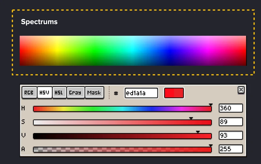
Every color has three parts. Hue is the spectrum: red, yellow, blue. Saturation is how intense that spectrum is. Value is how light or dark it is. Your editor's color picker has a slider for each, usually labeled HSV. When I say "shift the hue" or "darker value" below, these are the sliders I mean.
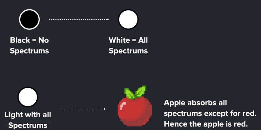
And why is an apple red? Light carries all the spectrums. The apple absorbs all of them except red, and reflects the red back to your eye. That's also why shadows and lights change color, not only brightness: the light itself has a color.
Step 1: Pick the main tone
The main tone, or midtone, is the color of the material in plain light: the brown of the wood, the blue of the water. Not the shadow and not the shine. Pick it first and put it on the biggest area of your sprite. Everything else is built from this one color.
Step 2: Make the shade
Pick the main tone with the eyedropper and move it darker. Then move the hue a little too, toward red or toward a cooler color, and add a touch of saturation. A shade that is only darker often looks dirty and gray. A shade with a small hue shift looks like the same material in shadow.
Step 3: Make the light
Same thing the other way. Make it lighter, move the hue toward yellow, and take a little saturation away. Lights that only get brighter can look washed out or neon. With the hue shift they look warm and natural.
Step 4: Add tones in between only where you need them
Now you have three colors. Draw with them first. If a step between two colors looks too harsh, make a tone halfway between them: pick one, slide it toward the other in hue and value until it sits in the middle. That's also your anti-aliasing color. I usually end up with four or five colors per material.
Real palettes from my lessons
Here are three palettes from my interactive lessons, from the darkest color on the left to the lightest on the right.
Look at fire and wood side by side. Fire's colors travel all the way from red to yellow. The wood stays brown the whole way. Both are right: how far the hue moves depends on the material. Fire changes color with heat, wood just gets darker in the shade.
Rules that keep a palette clean
- Start small. Three colors, then add only when you need one. A small palette is way easier to keep consistent.
- Never use opacity or the blur tool. Semi transparent pixels mix into new colors you never picked, and the palette gets muddy.
- Keep saturation similar across the scene. One very saturated color next to soft ones steals all the attention.
- One main tone per part. If a part has too many shades, go back to one flat color and build the shade and light again.
- Limits are a choice. The famous 16 or 32 color limits came from old consoles. They are a good exercise, not a rule of the art form.
When you're stuck
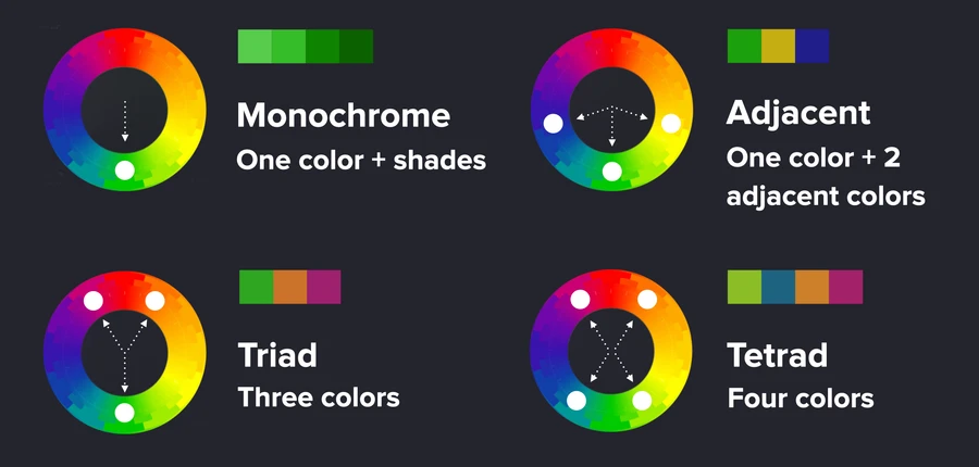
Use a palette someone already balanced. Lospec has thousands of free pixel art palettes, and I use them a lot. For picking colors that go together, a color wheel tool like Paletton helps: adjacent colors for calm scenes, a triad for more contrast. Then take the colors into your editor and build the shades and lights from them the same way as above.