
Most pixel art mistakes have a name: doubles, jaggies, banding, pillow shading, over anti-aliasing and noise. Once you know the names, you start to see them in your own work, and each one has a simple fix.
Students often ask me what people mean when they say their art has banding or pillow shading. Fair question. I show the fixes in my lessons, but I don't always say the names. So here they are, one by one, in plain words. For each one: what it is, why it looks wrong, and how to fix it.
Mistakes in lines
Doubles
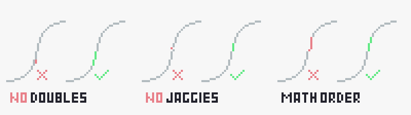
A double is a pixel too many in a line: two pixels sit side by side, touching on the flat side, where one diagonal step would do. It makes the line look thicker in that spot, and the eye catches it right away. The fix: remove one of them, so the line steps only through the corners. A line should be one pixel wide everywhere.
Jaggies
Jaggies are steps in a line that don't follow a pattern. A smooth line or curve changes its runs little by little: 3, 3, 2, 1, then 2, 3, 4. If it jumps from 2 to 6 to 1, it looks broken. A single misplaced pixel does the same. The fix: keep straight lines on a clean ratio (1:1, 1:2, 1:3) and let curves change by one or a couple of pixels at a time.
Mistakes in shading
Pillow shading
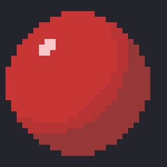
Pillow shading is when the shadow follows the outline all the way around and the light sits in the middle. The object looks flat and puffy, like a pillow. It happens when you shade from the edges instead of from the light. The fix: decide where the light comes from first. The side facing the light gets the light colors, the far side gets the shades. Every pixel has to agree with that one light.
 ✗ Wrong
 ✓ Right
Banding
Banding is when shading tones sit in neat stripes of the same width that follow the outline, or when the steps of two tones line up right next to each other. The stripes become the first thing you see, and the form gets lost. The fix: make the shapes of your tones different widths, follow the form and the light instead of the outline, and break up lined up steps.
 ✗ Wrong✓ Right
Flat shading
One color per part and no shade or light at all. It's not wrong for a first pass, that's exactly how I lay down the base colors. But if it stays like that, the object has no volume. The fix: add one shade on the dark side and one light on the lit side. Usually that's enough.
 First passFinished
Mistakes in details
Over anti-aliasing
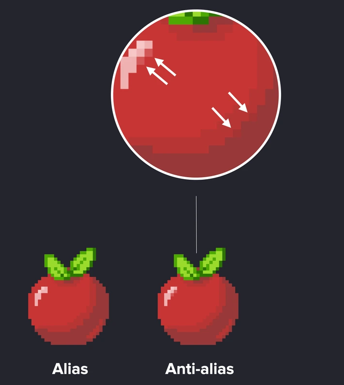
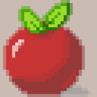
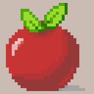
Anti-aliasing means placing in-between colors on the steps of a line or curve, so it looks smoother. A few pixels here and there help a lot. Too many, and the edge gets blurry and soft, and the sprite loses its crisp pixel look. The fix: anti-alias only the longer steps on curves, and check the sprite at real size. If you can't see the difference at 1x, you don't need those pixels.
 ✗ Wrong
 ✓ Right
Noise and stray pixels
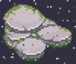
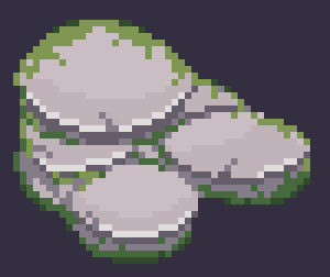
Noise is single pixels of a different color scattered around with no reason: in a texture, inside a shape, or floating next to it. They look like dirt on the screen. The fix: group pixels into clusters with a clear shape. Sparks and particles are fine, when you put them there on purpose.
 ✗ Wrong
 ✓ Right
Mixed pixel sizes
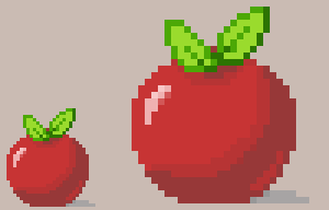
Some artists call these fat pixels. It's when parts of one picture are scaled up, so some pixels are bigger than others. It breaks the grid and looks off right away. The fix: never scale a sprite to make it bigger. Redraw it at the new size, and keep one pixel size in the whole scene.
Words for things you want
Sel-out
Selective outline. Instead of a black outline all around, the outline takes colors from the area next to it: lighter on the lit side, darker on the shadow side. In my lessons I do it at the color step: once the shape is clear, I recolor the black outline with a darker tone of its neighbor. The object looks softer and sits better in the scene.
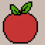 Black outline
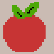 Sel-out
Dithering
Dithering is a checkerboard or similar pattern of two colors, so from a distance they read as a color in between. It's useful for soft transitions, like a sky or a glow. Used a lot, it looks noisy and aggressive. Keep it small and on purpose.
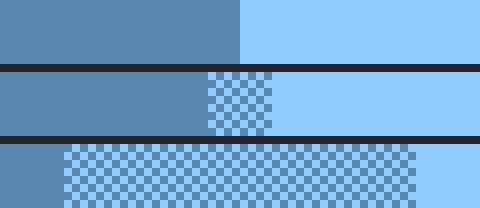
Color ramp and hue shifting
A color ramp is the line of tones you use for one material, from the darkest shade to the brightest light. Hue shifting means the hue moves along that ramp instead of only getting darker or lighter. Shades usually lean toward a cooler or redder hue, lights toward a warmer, yellower one. That's what keeps a ramp alive instead of muddy. I start a palette from a midtone and build three to five colors around it.

Check your own piece
- Are my lines one pixel wide, with no doubles?
- Do my curves change step by step, with no jaggies?
- Does all the shading follow one light, not the outline?
- Are my tones different shapes, not stripes?
- Do I see a difference from my anti-aliasing at 1x?
- Is every single pixel there on purpose?
In my interactive lessons, the "Draw your own" mode checks some of these for you. When you draw your own version from scratch, it marks the doubles in your lines and the stray pixels, and it checks that your light sits on the right side. Try it on the apple or the rocks.